08.05 · From wireframe to website / Learn · 6 guided steps
Adapt the wireframe for phones
Keep a readable phone layout while adding a wider two-column arrangement.
Activity 5 of 6 in From wireframe to website
CSS Basics / 08.05
Adapt the wireframe
Not started
Keep a readable phone layout while adding a wider two-column arrangement.
Your lesson progress
Empty: not started. Yellow: in progress. Green: complete. Marking the whole activity complete does not replace your test results. These circles save in this browser for this pilot.
Understand the plan
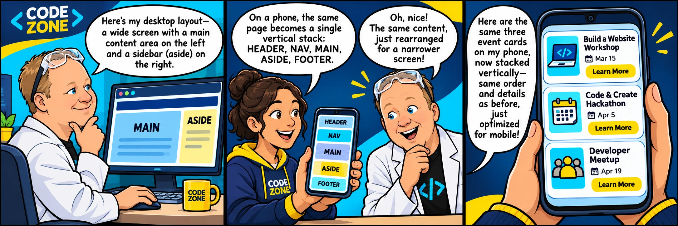
Start with one column and a useful content order. A min-width media query adds the desktop arrangement only when there is room. Both the column template and named area map must change together.
The preview viewport is independent of your screen. Choose 390px to inspect the phone map and 1280px to trigger the wider layout. Scale to fit changes how the preview is displayed, not which media query runs.
Explore the wireframe
The aside moves below main on phones and beside it on desktop. The HTML order stays the same. Inspect navigation focus with Tab as well as checking the automatic layout results.
Select a labeled region. Compare its purpose with its position. These controls change this demonstration only.
main.contentPlace the featured invitation and three event articles here.
Desktop: main and aside sit beside each other. The main column receives two shares of the available width.
Preview the finished practice
This target is a visual reference, not starter code. Use its width controls to inspect the layout. Your own code stays separate.
Build it in small steps
The aside moves below main on phones and beside it on desktop. The HTML order stays the same. Inspect navigation focus with Tab as well as checking the automatic layout results.
The workshop opens in a new tab. Your own code carries forward; each step has a focused check and an optional hint.
Start workshop(opens in a new tab)6 steps · Saved work · Instant feedback
Look up the property you need
You do not need to memorize every value. Use documentation to check a property, then explain what it changes in this layout.
Your turn: repair one problem
This is a separate saved challenge. The workshop completion and code remain unchanged.
The checks below assess this repair. Passing them does not complete the guided workshop.
YOUR TURN
Repair the breakpoint
Work through the checklist in styles.css. Run the preview, then check your work.
- In
styles.css, below theSCREEN MEDIA MIN WIDTH 800PXcomment, add a media block with the condition(min-width: 800px). - In
styles.css, add a rule with selector.siteinside the@media (min-width: 800px)block. - Set its
grid-template-columnsproperty tominmax(0, 2fr) minmax(0, 1fr). - In
styles.css, add a rule with selector.siteinside the@media (min-width: 800px)block. Use occurrence number 2 of this selector in source order. - Set its
grid-template-areasproperty to"header header" "nav nav" "main aside" "footer footer". - Keep the supplied page content, classes, IDs and link destinations unless a checklist item explicitly changes them.
- Keep the one-column phone map outside that query.
Edit styles.css and watch the preview update after you pause typing. Open index.html to inspect its stylesheet link. Run or Check saves immediately. Word wrap is enabled.
Ready to checkRun the checks to see your results here.
Your check results
Need a nudge?
Focus on the requested rule
Change the desktop media query from min-width: 1800px to min-width: 800px.
Compare the two preview widths
Use the Phone and Desktop preview sizes. The preview width controls the media queries; the size of your monitor does not. Keep unrelated declarations and all supplied content.
One possible solution
Your code may look different and still be correct. Compare the approach with your own.
Explain the rule you changed and compare both preview widths. Your workshop code is a separate saved project.
/* STYLE ALL ELEMENTS */

* {
  box-sizing: border-box;
}

/* STYLE BODY */

body {
  margin: 0;
  font-family: Arial, sans-serif;
  line-height: 1.6;
  color: #17283c;
  background-color: #eef4f8;
}
/* STYLE CLASS SITE DIRECT CHILD ALL ELEMENTS */
.site > * {
  padding: 20px;
  border-radius: 10px;
  background-color: white;
}
/* STYLE CLASS MASTHEAD AND CLASS FOOTER */
.masthead,
.footer {
  background-color: #12304a;
  color: white;
}
/* STYLE A */
a {
  color: #007396;
}
/* STYLE CLASS SITE */
.site {
  display: grid;
  gap: 20px;
  width: 92%;
  max-width: 1100px;
  margin: 24px auto;
}
/* STYLE CLASS MASTHEAD */
.masthead {
  grid-area: header;
}
/* STYLE CLASS NAVIGATION */
.navigation {
  grid-area: nav;
}
/* STYLE CLASS CONTENT */
.content {
  grid-area: main;
}
/* STYLE CLASS DATES */
.dates {
  grid-area: aside;
}
/* STYLE CLASS FOOTER */
.footer {
  grid-area: footer;
}

/* STYLE CLASS SITE LATER RULE 2 */

.site {
  grid-template-columns: minmax(0, 1fr);
  grid-template-areas: "header" "nav" "main" "aside" "footer";
}

/* STYLE CLASS CONTENT AND CLASS DATES */

.content,
.dates {
  min-width: 0;
}

/* SCREEN MEDIA MIN WIDTH 800PX */

@media (min-width: 800px) {
  .site {
    grid-template-columns: minmax(0, 2fr) minmax(0, 1fr);
  }
}

/* SCREEN MEDIA MIN WIDTH 800PX */

@media (min-width: 800px) {
  .site {
    grid-template-areas: "header header" "nav nav" "main aside" "footer footer";
  }
}

/* STYLE CLASS DATES LATER RULE 2 */

.dates {
  align-self: start;
}
/* STYLE CLASS CONTENT LATER RULE 2 */
.content {
  min-height: 240px;
}

/* STYLE CLASS NAVIGATION A */

.navigation a {
  display: inline-block;
  padding: 10px 14px;
}
/* STYLE CLASS NAVIGATION A FOCUS VISIBLE */
.navigation a:focus-visible {
  outline: 3px solid #007396;
  outline-offset: 3px;
}
/* SCREEN MEDIA MIN WIDTH 1800PX */Ready to try it?
Practice in your browser and see your results.
Progress details
Have a question?
Ask the Code Zone community.
Ask a question in The Code Zone (opens in a new tab)Continue learning

7 days freeTry The Code Zone
THE CODE ZONE COMMUNITY
Your next step is easier together.
Try the community free for 7 days.
No charge during your trial. Choose your plan on Skool.
- Ask questions and get support in the community
- Watch every course video walkthrough
- Find a study buddy in the 24/7 study room
Make the most of your trial with Premium.
Choose Premium on Skool to try Thursday live help sessions. Bring your questions, work through code, and get unstuck together.
Scheduled Thursdays in Eastern Time. Check the Skool calendar for your local date and time.
Have a website account? Sign in