Responsive Web Design / CSS / Basic CSS
Build a Stylized To-Do ListMake tasks and their links easy to use.
Watch Rob build the project, understand what each part is for, then work through the official freeCodeCamp lab at your own pace.
ORIGINAL WALKTHROUGH · 20:41
Watch with Rob.
Pause whenever you want to try a change. You can return to the lesson at any time.
You are signed in, but video access needs attention. Check your account access. Your saved work is kept.
Video walkthroughs are included with an active Code Zone membership. The written lesson and practice are free.
The current freeCodeCamp requirements are the reference when a recording differs. These guide topics are not timestamped video chapters.
THE IDEA BEHIND THE BUILD
What this lab teaches
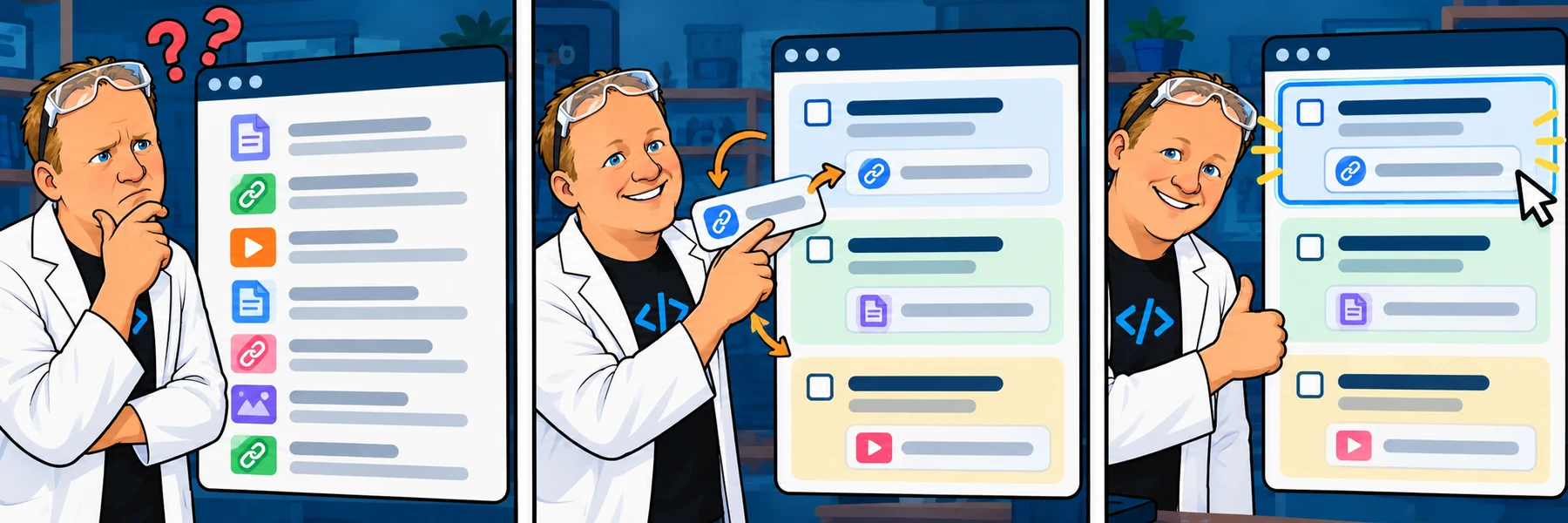
A task list combines two different interactions: selecting a task and opening its supporting resources. This lab asks you to keep those roles understandable while adding several visual states to the links.
Build the repeated list structure before styling it. Give each checkbox a unique identity and an associated label, then keep each supporting link with its task. Compare normal, visited, hover, active and focus states instead of treating every state as a variation of pointer hover.
Keep related content together
Use a nested list to associate each task with its supporting resource.
Connect task labels
Give every checkbox a unique ID and the correct associated label.
Support keyboard interaction
Make focus visible as well as distinguishing the pointer and visited states.
REVIEW THE REQUIREMENTS · THREE CLEAR GOALS
Your route through the lab
These groups are a reading guide to the lab, rather than timestamped chapters of the video.
Build the task collection
Create the list structure and connect each checkbox to its task label.
Check your understanding: The nested resources belong to the correct task and label clicks toggle the intended control.
Explore topic 1Connect the resources
Give each link a meaningful destination and the requested new-tab behavior.
Check your understanding: The resource text and destination agree.
Explore topic 3Review link states
Style the normal and interactive states, then test with pointer and keyboard.
Check your understanding: A focused link is visibly identifiable and the official checks pass.
Explore topic 4SEE HOW THE PARTS FIT
A page with a clear structure
This separate equipment-guide link illustrates a visible keyboard focus cue. Its class and styles are different from the official task-list solution.
.guide-link:focus-visible {
  outline: 3px solid #147da6;
  outline-offset: 3px;
}
task + labelIdentify the checkbox actionnested resourceKeep related guidance beside the tasklink statesShow navigation and keyboard focusThree things to pay attention to
A label must point to one control
Repeated IDs make explicit associations ambiguous. Give each checkbox its own identity.
Hover is only one interaction
A keyboard user needs a visible focus cue even when no pointer is hovering over the link.
A styled link still navigates
Keep the resource destination meaningful and make the new-tab behavior understandable.
UNDERSTAND IT HERE · PRACTICE IT THERE
Explore the key concepts
Choose a topic for a plain-English explanation, a separate code example and resources to explore. When you are ready, its button opens the official freeCodeCamp lab. Your official tests and completion stay on freeCodeCamp.
Topic 1Organize tasks as a collection
UNDERSTAND THE IDEA
A list communicates that several entries belong together. A nested list can keep each task’s supporting resources near that task instead of mixing all links into one unrelated collection.
What you will do
Review the official list and nesting requirements before styling the task entries.
<ul class="session-plan">
  <li>Prepare the workbench
    <ul><li>Read the equipment guide</li></ul>
  </li>
</ul>
What to notice: This session plan uses a different class and content. The nested list belongs inside its parent list item, not beside the outer list.
Resources to explore
Read another explanation or experiment with examples before trying the official lab.
Ready to try it? Use freeCodeCamp’s exact requirements and run its checks there. The example above is for understanding the concept.
Topic 2Associate a task with its checkbox
UNDERSTAND THE IDEA
A label explains a checkbox and gives it a larger activation target. An explicit association connects the label’s for value to one unique control ID.
What you will do
Add the required checkboxes and associated task labels. Make each input ID distinct.
<input type="checkbox" id="inspect-tools">
<label for="inspect-tools">Inspect the tools</label>
What to notice: The ID identifies one control. Reusing it for several tasks can make label clicks activate the wrong checkbox.
Resources to explore
Read another explanation or experiment with examples before trying the official lab.
Ready to try it? Use freeCodeCamp’s exact requirements and run its checks there. The example above is for understanding the concept.
Topic 3Give a resource link a clear destination
UNDERSTAND THE IDEA
An anchor expresses navigation to another resource. Useful text explains the destination, and opening a new tab should not surprise the learner.
What you will do
Build the supporting links with the class and new-tab behavior required by the lab.
<a class="guide-link" href="https://example.org/guide" target="_blank" rel="noopener noreferrer">Equipment guide (new tab)</a>What to notice: This is a neutral example destination. Link to a real relevant resource in your own project rather than treating a placeholder as a finished link.
Resources to explore
Read another explanation or experiment with examples before trying the official lab.
Ready to try it? Use freeCodeCamp’s exact requirements and run its checks there. The example above is for understanding the concept.
Topic 4Distinguish normal and visited links
UNDERSTAND THE IDEA
The base style describes an ordinary link; the visited pseudo-class can show that the browser has already followed its destination. Browsers restrict history-dependent styling for privacy.
What you will do
Apply the lab’s text-decoration and normal/visited color requirements while keeping links recognizable.
.guide-link { color: #174c68; text-decoration: none; }
.guide-link:visited { color: #633b79; }
What to notice: These classes and colors are analogous examples. Removing underlines means another visible cue should still identify the text as a link.
Resources to explore
Read another explanation or experiment with examples before trying the official lab.
Ready to try it? Use freeCodeCamp’s exact requirements and run its checks there. The example above is for understanding the concept.
Topic 5Make interaction states visible
UNDERSTAND THE IDEA
Hover, active and focus describe different interaction states. A keyboard focus indicator is especially important because pointer hover alone does not help a person tabbing through links.
What you will do
Complete the required hover, active and focus treatments, then test using both a pointer and the Tab key.
.guide-link:hover { color: #9b3c18; }
.guide-link:active { color: #552210; }
.guide-link:focus-visible { outline: 3px solid #147da6; outline-offset: 3px; }
What to notice: The lab has its own focus-selector requirement. This separate example adds a visible keyboard cue; it does not provide the complete task-list stylesheet.
Resources to explore
Read another explanation or experiment with examples before trying the official lab.
Ready to try it? Use freeCodeCamp’s exact requirements and run its checks there. The example above is for understanding the concept.
READY TO BUILD?
Keep the instructions beside the video.
Start the official lab in a new tab, play the walkthrough here, and pause to make each change yourself. Run freeCodeCamp’s checks before moving on. Write and check your project in the official freeCodeCamp editor.
An independent walkthrough by The Code Zone. Not affiliated with or endorsed by freeCodeCamp. The project and official tests belong to freeCodeCamp; the explanations and visual guide on this page are our companion material.